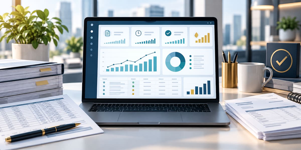
Accounts payable teams generate valuable information every day. Each invoice records a supplier, amount, processing date, payment status, responsible unit, and sometimes a funding source. Yet in many organizations, this information remains spread across monthly worksheets or buried in transaction reports. A well-designed dashboard brings those details together and turns them into a clear view of performance.
A spreadsheet records activity. A dashboard helps explain what the activity means. It lets finance staff and managers see whether invoices are processed on time, where work is piling up, and which areas may need extra attention.
Why Accounts Payable Teams Need More Than Raw Spreadsheets
Traditional spreadsheets remain essential for recording and reconciling transactions. The challenge appears when leaders must review thousands of rows to answer a simple question. How many invoices are outstanding? Which month had the longest processing time? Are certain departments consistently experiencing delays?
Without a dashboard, answering these questions may require separate formulas, filters, and manual summaries. That process takes time and can produce inconsistent results. A dashboard creates a repeatable reporting view, allowing you to review the same measures across months, departments, employees, or other operational categories.
The Measures That Matter
An effective accounts payable dashboard should focus on action-oriented measures. Too many figures can make the report hard to interpret. A practical dashboard may include the following indicators:
· Total invoices. Shows workload volume and helps management compare activity across reporting periods.
· Total invoice amount. Provides financial context and highlights periods or units with significant payment activity.
· Average processing days. Measures how long invoices take to move from receipt to entry or completion.
· On-time processing rate. Shows the percentage of invoices completed within the organization’s expected timeframe.
· Outstanding invoice count and amount. Identifies the size and financial value of the current backlog.
· Average invoice value. Adds context when workload volume and dollar activity move in different directions.
· Potential duplicate invoices. Flags records that may require review before payment or during reconciliation.
These measures should be based on agreed definitions. For example, an on-time rate is meaningful only when the organization has clearly defined when the processing period begins, when it ends, and which transactions are included.
From Data to Management Decisions
A dashboard's greatest value comes from its ability to reveal patterns. A high-level result may show that average processing time is acceptable, while a monthly or departmental view may reveal a specific area with recurring delays. A rising outstanding balance may point to missing approvals, incomplete documentation, supplier issues, or staffing constraints.
Filters make this analysis more useful. Management can review performance by month, bureau or department, processor, payment status, funding source, or other relevant category. Instead of creating a separate report for every question, users can examine the same trusted data from several perspectives.
This does not mean every variation represents poor performance. Differences may reflect invoice complexity, workload distribution, special projects, or year-end activity. The dashboard flags where a closer review may help; professional judgment explains the numbers.
Stronger Controls and Greater Accountability
Dashboards also support internal controls. Outstanding-invoice reports can help staff follow up before due dates. Duplicate-detection indicators can identify records with matching invoice numbers, suppliers, descriptions, or amounts. Exception reports can highlight missing dates, incomplete coding, unmapped departments, or unusual processing times.
Used correctly, these tools are not designed to monitor employees in isolation. They create visibility into the entire workflow. Managers can identify training needs, rebalance assignments, improve procedures, and recognize strong performance. Employees gain a clearer understanding of expectations and can see how their work contributes to the organization’s financial operations.
Reliable Dashboards Begin With Reliable Data
A visually attractive dashboard cannot correct unreliable source data. Consistent entry standards are therefore essential. Store dates as valid dates, use standard definitions for payment statuses, map department names consistently, and enter invoice identifiers in a uniform format.
Organizations should also document how each measure is calculated. This creates confidence in the results and makes the dashboard easier to maintain. When definitions change, update the formulas, data model, and explanatory notes together.
A Practical Approach to Building an Accounts Payable Dashboard
1. Define the decision. Begin with the questions management needs to answer, not with a chart type.
2. Standardize the source data. Use consistent columns, formats, status labels, and department mappings.
3. Select a focused set of measures. Choose indicators connected to timeliness, workload, outstanding items, accuracy, and control.
4. Add useful filters. Allow users to examine results by reporting period and operational category.
5. Validate the results. Compare dashboard totals with source records and investigate unexplained differences.
6. Explain the story. Present the trend, the likely cause, and the recommended action in plain language.
The Real Value Is Better Conversation
A dashboard is most effective when it improves the conversation between finance staff and management. Instead of spending the entire meeting assembling totals, the team can discuss why performance changed, what risks need attention, and which improvements to prioritize.
The goal is not simply to create more reports. It is to make existing information easier to understand and use. When accounts payable data is accurate, organized, and presented clearly, it becomes a management resource rather than a historical record.
Turning Accounts Payable Information Into Action
Moving from spreadsheets to dashboards does not require abandoning Excel or rebuilding every process at once. It begins with a clear reporting purpose, reliable data, and a small set of meaningful measures. The dashboard can then grow as users gain confidence and new reporting needs emerge.
Accounts payable professionals already work with the information needed to support stronger decisions. A dashboard simply organizes that information so trends, risks, and opportunities become easier to see.
| Continue learning: Explore Elkanah Osiemo’s Mastering Accounts Payable series for practical guidance on accounts payable operations, Excel automation, dashboards, internal controls, and performance analytics.
About the author
Elkanah Osiemo is an accounting professional, author, and business analytics practitioner who creates practical resources on accounts payable, Excel, internal controls, career development, and data-informed decision-making.